Hero Component Breakdown
With the website supported by the design system, and a recent merge with the marketing team, it seemed fitting that we extended the system to support the marketing design efforts across the website, paid advertising, and social media. This took the form of a dedicated design library within our Figma team that contained components to aid the creation of digital assets. One component set created for this purpose was for the heroes found on our homepage and category landing pages.
Component Architecture
The main need for this component set was to be able to generate heroes with backgrounds and text lockups quickly. I created three sub-components and nested them together to create the primary component.
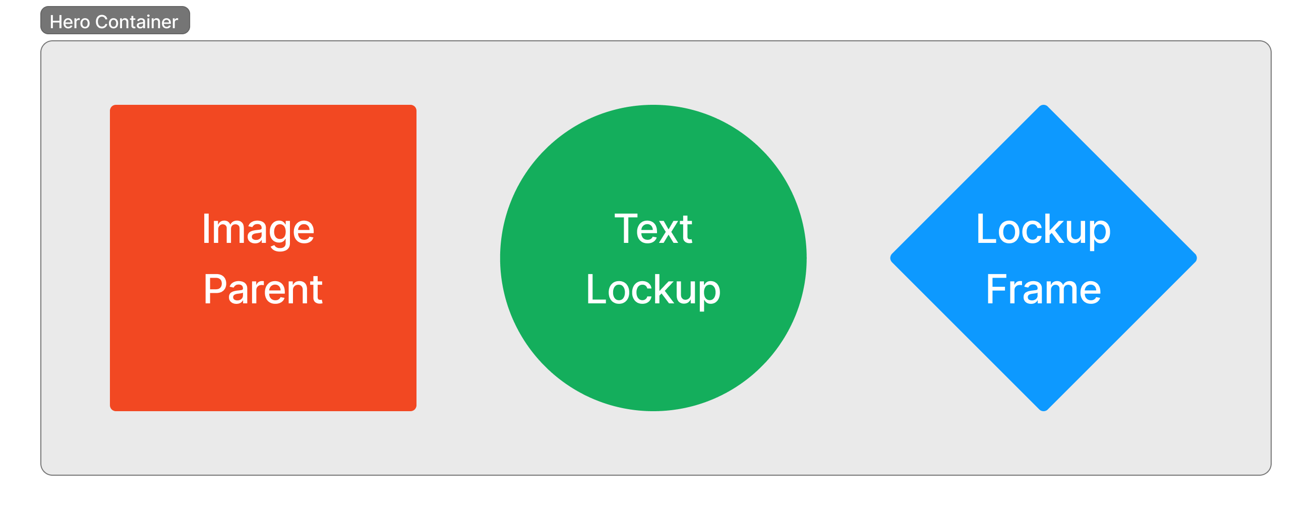
Image Parent
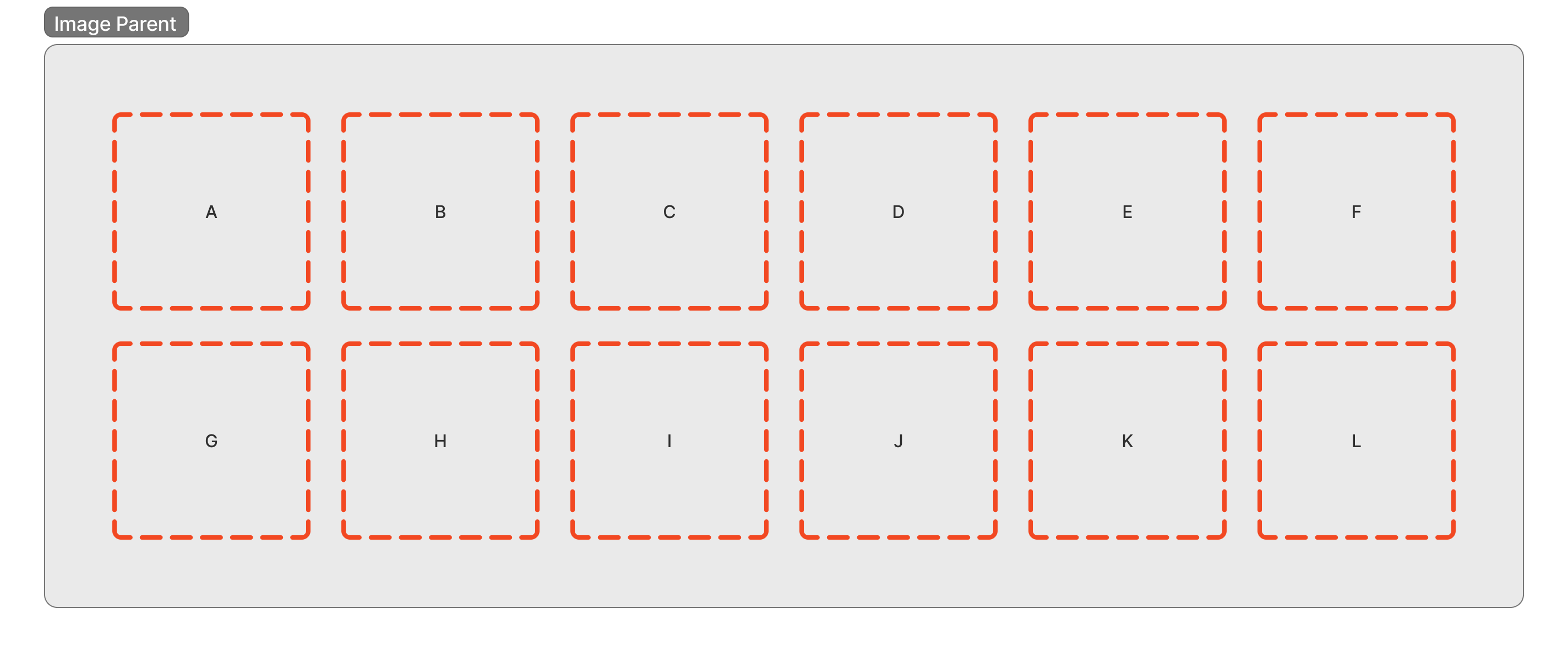
The image parent is pretty simple, it’s a collection of 12 frames that house the background options. This improves the current process where each image is being manually applied across a number of digital assets, replacing each placement with an instance of the image parent. This component will be nested in all the primary components found in this library.
Text Lockup
Next, we have the text lockup. This component is also simple, as it’s just a collection of custom text layouts that are specific to different sales, events, and otherwise. But making this a sub-component itself prevents a large amount of maintenance in the next component by isolating the number of variants it supports.

Lockup Frame
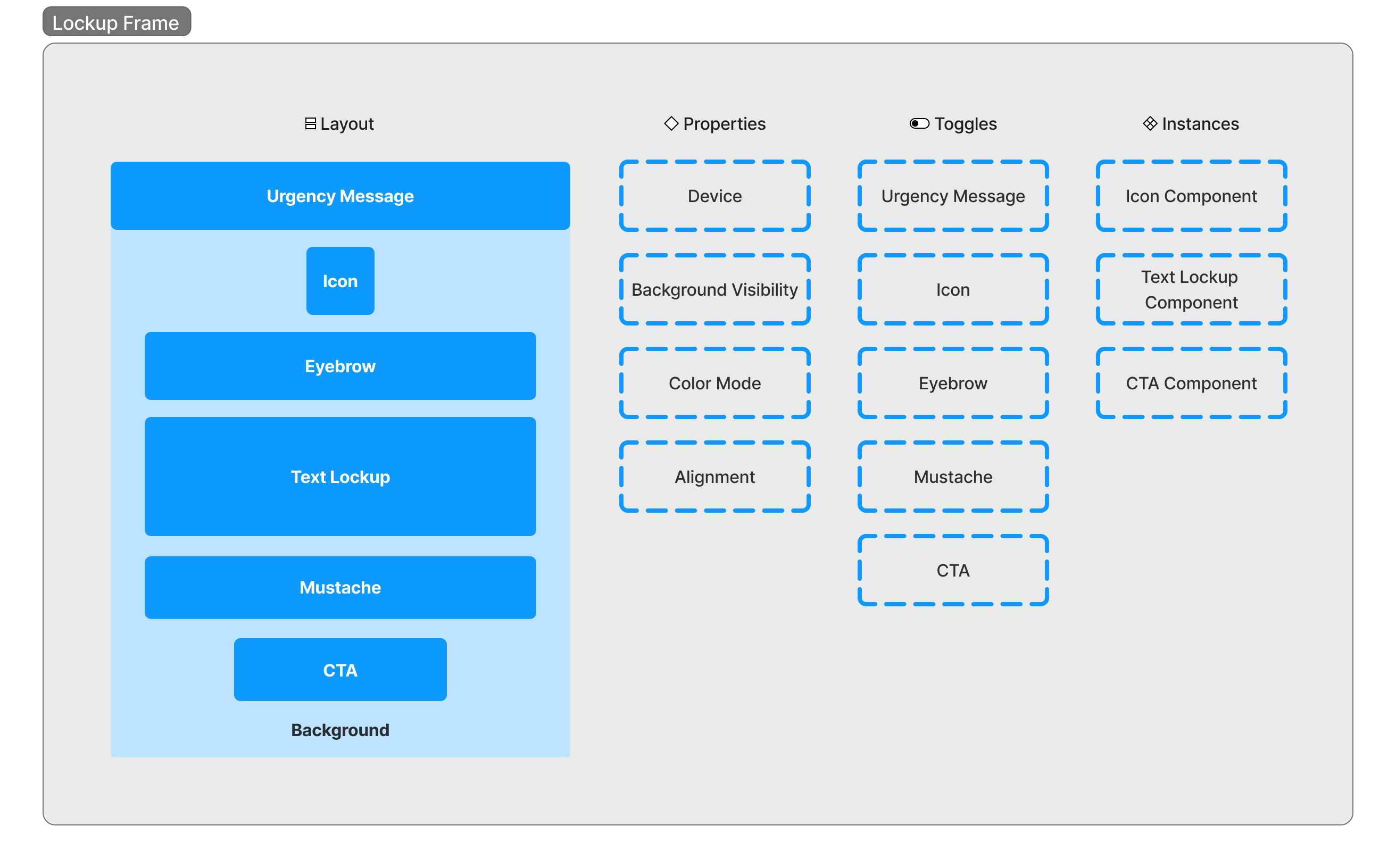
The lockup frame is the most complicated out of the sub-components. This is where we nest the text lockup for displaying. It also contains a number of additional variants and toggleable elements intended to bolster the messaging in the main text lockup.
Hero Container
Combined, we use the image parent as the background and the lockup frame as an overlay, creating any number of variants at this level for positioning and styling.

Asset Production
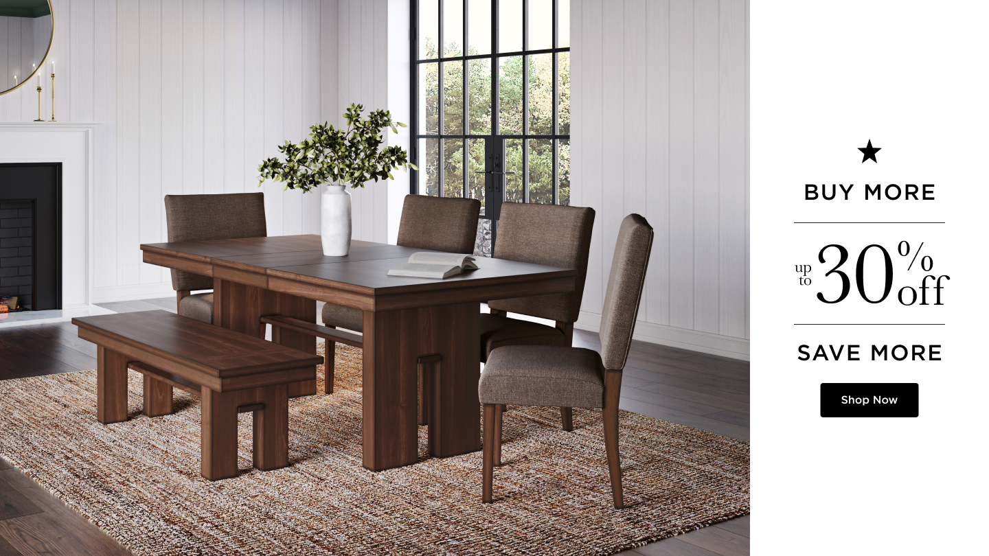
The existing asset production workflow is manual, where marketing designers individually handle the creation of text elements, placement of images, and layouts for every asset related to a particular event or sale. With the introduction of new component sets, we aim to streamline this process by eliminating hundreds of manual steps. In the case of the hero component set, designers now only need to populate the image parent, select or add text lockups, and configure properties for desktop and mobile instances. This significantly reduces duplicative work, allowing designers to focus on refining details and preparing assets for export with minimal effort.

Conclusion
This component set is just one of many planned for this particular design library. The marketing team is a team that delivers on tight timelines, and the more time we can save them upfront the faster they can deliver. It also allows the designers to focus on being creative rather than setting up their documents, which enhances our brand image. This exercise has proven to be a significant enhancement to our current digital asset creation process and the company has recognized the value it brings. Our goal is to expand its coverage to address as many cases as possible.