Habitat Design System (UX House)

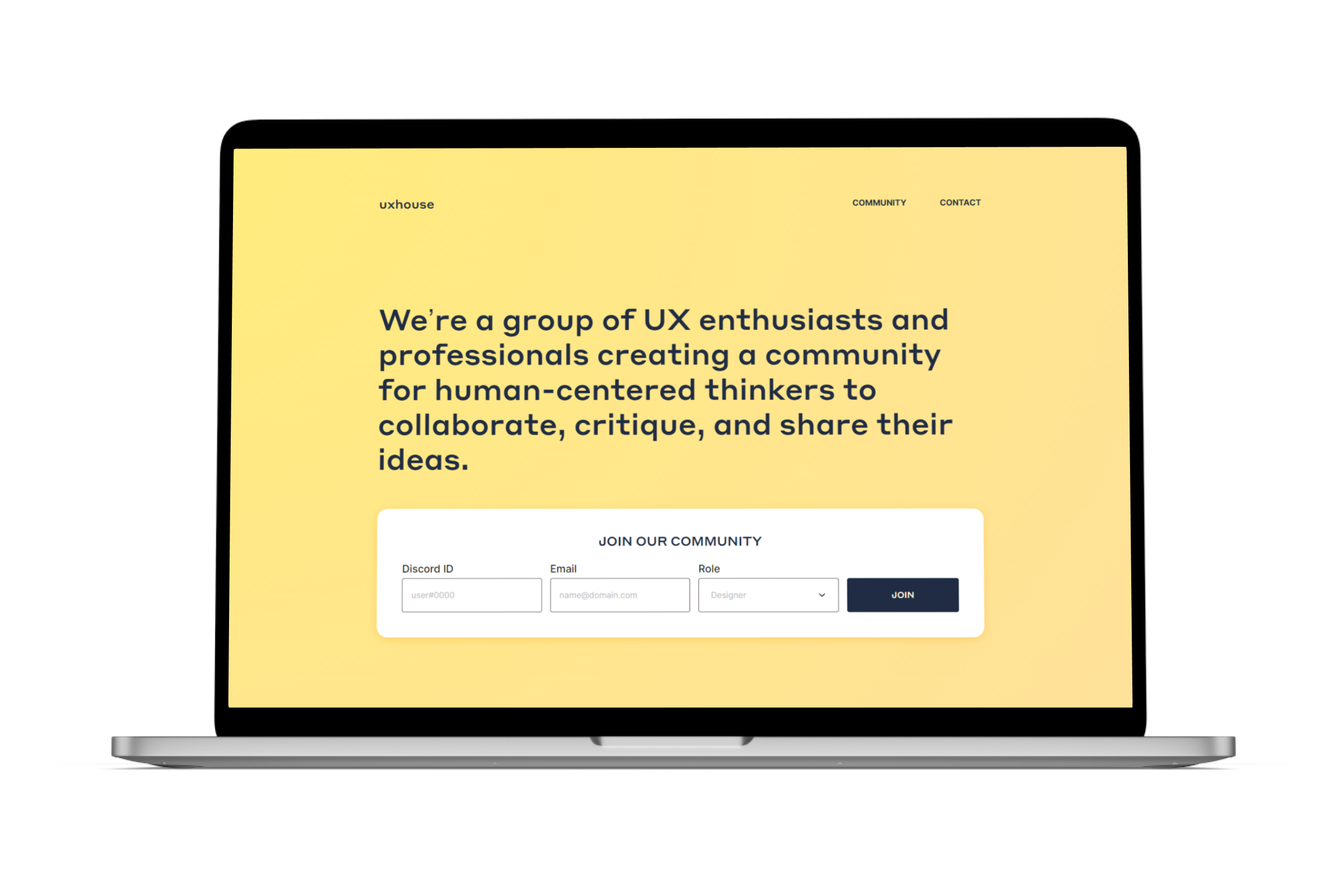
UX House started in the fall of 2019 as a way to connect with more individuals in and/or interested in the product design field. As the community administrator, it’s been my role to facilitate relationships between members to help foster growth for everyone no matter where they are in their career journey. One such effort was to work as a community to build a design system.
Foundations
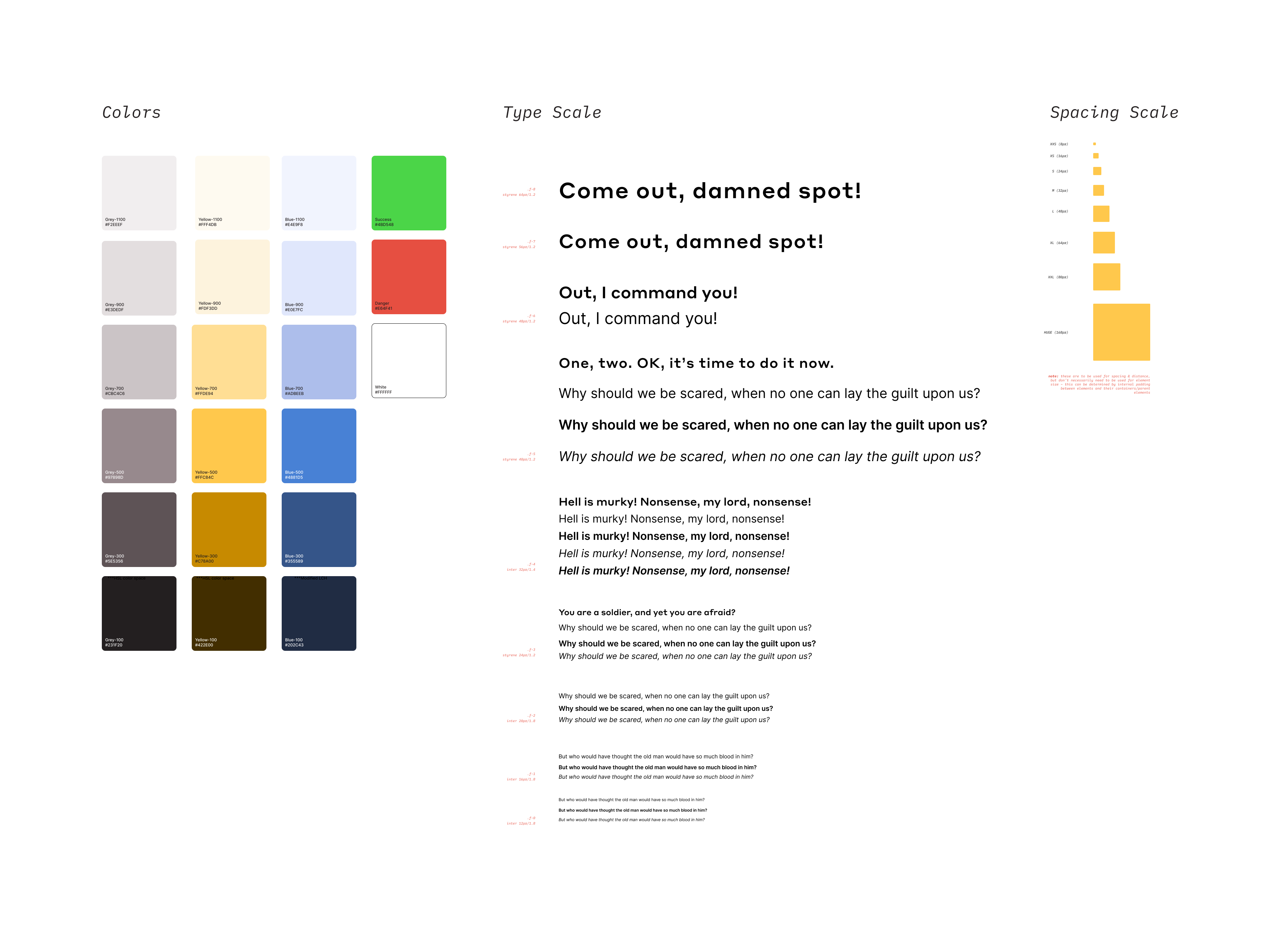
As a large portion of the team were students, we started by focusing on the fundamentals for this project. We defined the foundation of the design system with color styles, a type scale, and spacing rules. This allowed us to build our components with consistency in look and feel while offering the flexibility we needed to create complex features. As we began building those features, we revisited the base elements a few times to include border styles, gradients, and elevation.
Implementation
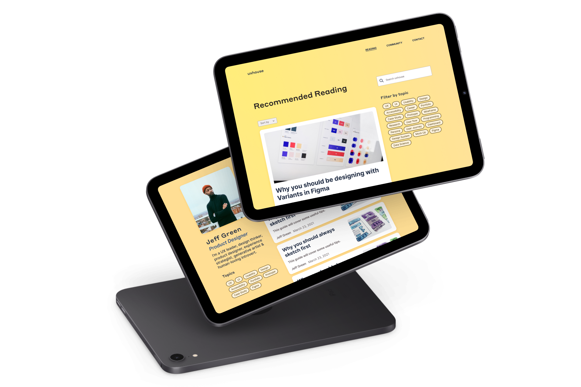
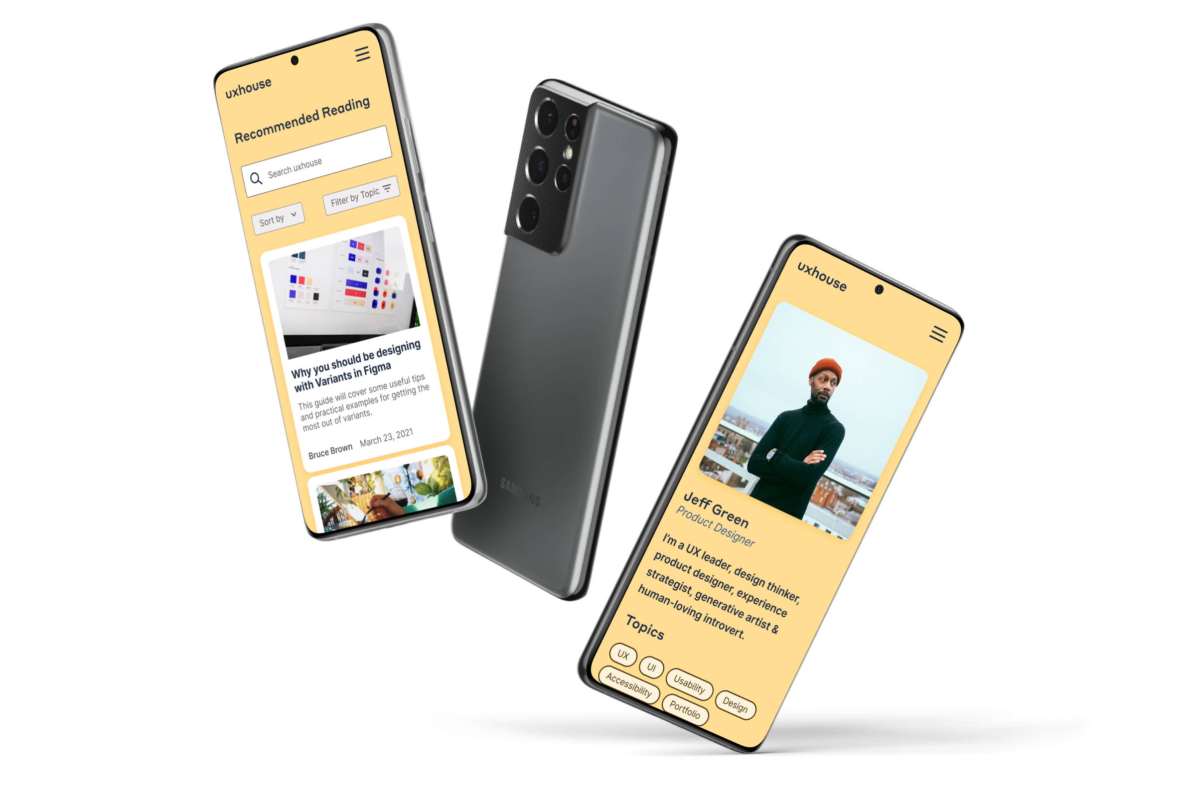
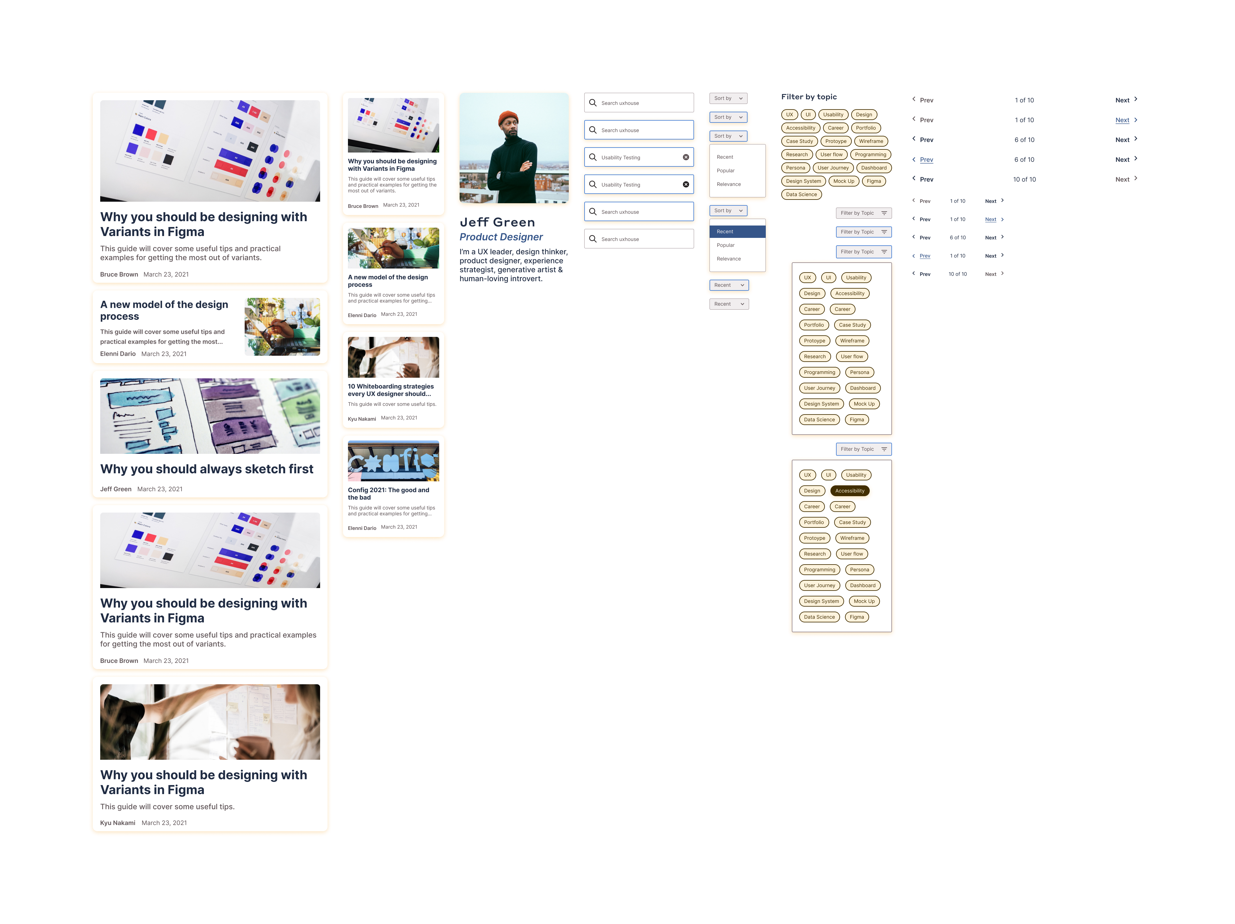
As a way to put the DS into practice, we looked to expand the UX House website to be a content hub. This would make it a platform for our members’ work and experience to be showcased. We built a number of components to support listing pages with filtering, author pages, and article pages. As we finalized the design of each feature, we would componentize them and contribute them back into the DS.
Conclusion
By the end of the project, we had a small but formidable design system, which we named Habitat. It supported all the features we needed it to with room to grow and gave the members involved experience working on an actual product. We’re currently tracking down developer resources to build out the content expansion for the site. In the meantime, we will be using Habitat to continue establishing our brand and supporting our community events.
